Table of Contents
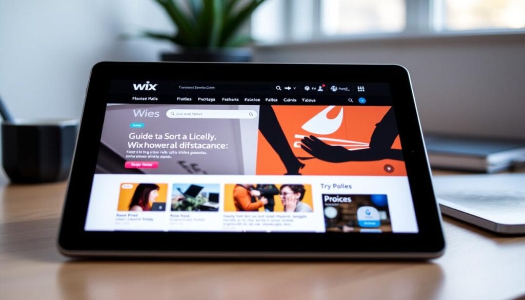
Is your Wix website getting cut off on iPad? As a Wix website owner, you’ve poured your heart and soul into crafting a visually stunning online presence. But have you ever experienced the frustration of seeing your carefully designed pages get cut off or distorted when viewed on an iPad? This issue can be a real thorn in the side, undermining the seamless user experience you’ve worked so hard to achieve.
If this sounds all too familiar, don’t worry – you’re not alone. Many Wix users have grappled with this challenge, but there are solutions within your reach. In this article, we’ll dive deep into the world of responsive design and mobile optimization, equipping you with the knowledge and tools to ensure your Wix website looks and performs flawlessly on Apple’s iconic tablets.
Key Takeaways
- Understand the common display issues that can occur on Apple devices like the iPad
- Learn how screen resolution and viewport settings impact the appearance of your Wix website
- Discover essential tools and techniques to diagnose and fix iPad display problems
- Implement responsive design best practices to ensure your Wix site adapts seamlessly to different screen sizes
- Explore advanced mobile optimization strategies to take your Wix website to new heights
Understanding Why Your Wix Website Gets Cut Off on iPad
When it comes to website rendering and cross-device compatibility, the iPad can pose some unique challenges. The display issues often encountered on Apple devices, coupled with the impact of screen resolution and viewport settings, can lead to your Wix website getting cut off or appearing incorrectly on iPad screens.
Common Display Issues on Apple Devices
Apple devices, including the iPad, have their own set of display characteristics that can impact website rendering. These may include:
- Varying screen sizes and aspect ratios across different iPad models
- High-resolution Retina displays that require careful optimization
- Potential conflicts between website content and native iOS user interface elements
Impact of Screen Resolution and Viewport Settings
The screen resolution and viewport settings of the iPad can significantly affect how your Wix website is displayed. If these factors are not properly addressed, you may encounter issues such as:
- Content being cut off or appearing outside the visible area of the screen
- Improper scaling and sizing of elements, leading to a disjointed layout
- Difficulties in ensuring consistent website rendering across different iPad models
Browser Compatibility Factors
Additionally, the compatibility of your Wix website with the specific web browsers used on iPads can also contribute to display problems. Factors such as:
- Differences in browser rendering engines
- Variations in browser support for CSS and JavaScript features
- Potential issues with third-party plugins or libraries used on your website
All of these elements can collectively impact the way your Wix website is presented on iPad devices, resulting in the frustrating experience of content being cut off or not properly displayed.
| iPad Model | Screen Resolution | Aspect Ratio |
|---|---|---|
| iPad Pro 12.9-inch | 2048 x 2732 pixels | 4:3 |
| iPad Air 4 | 1640 x 2360 pixels | 4:3 |
| iPad mini 6 | 1536 x 2048 pixels | 4:3 |
Essential Tools for Diagnosing iPad Display Problems
Ensuring your Wix website displays correctly on iPad devices is crucial for providing an optimal user experience and maintaining browser compatibility. To identify and address any website rendering issues, you’ll need to leverage a suite of powerful diagnostic tools.
One of the most valuable resources is the browser’s built-in developer tools. Whether you’re using Safari, Chrome, or Firefox, these developer consoles offer a wealth of insights into how your website is being interpreted and rendered on different devices. By inspecting the website rendering, you can pinpoint layout discrepancies, overflowing content, and other display problems specific to iPad.
In addition to browser-based diagnostics, there are also responsive design testing platforms that allow you to preview your Wix website across a range of devices, including various iPad models. These tools simulate the browser compatibility and viewport settings of different devices, providing a comprehensive view of how your content will appear on each screen size.
For Wix users, the platform itself offers several built-in diagnostic features to help identify and resolve display issues. The Wix Mobile Editor, for instance, allows you to switch between different device views, making it easier to spot and fix user experience problems on iPad.
- Leverage browser developer tools for in-depth website rendering analysis
- Utilize responsive design testing platforms to preview your Wix site across iPad models
- Explore Wix-specific diagnostic features, such as the Mobile Editor, to identify and address display problems
By combining these essential tools and techniques, you’ll be well-equipped to diagnose and resolve any display problems your Wix website may be experiencing on iPad devices, ensuring a seamless user experience across all platforms.
Wix Website Getting Cut Off on iPad: Quick Solutions
If your Wix website is getting cut off on iPad, there are a few quick and easy solutions you can implement to resolve the issue. By addressing common display problems, optimizing content containers, and fixing overflow issues, you can ensure your website looks great and functions seamlessly on iOS devices.
Adjusting Mobile View Settings
Start by accessing the Wix editor and navigating to the “Mobile View” settings. Here, you can make adjustments to the layout, sizing, and positioning of your website elements to ensure they are properly optimized for iPad and other mobile devices. Experiment with different settings to find the perfect balance between mobile optimization and visual appeal.
Optimizing Content Containers
Another effective solution is to review the structure and layout of your content containers. Ensure that your text, images, and other elements are properly sized and positioned within their respective containers. This will help prevent content from being cut off or overlapping on the iPad’s display.
Fixing Overflow Issues
Lastly, address any overflow issues that may be causing your website content to extend beyond the iPad’s viewport. Utilize responsive design techniques, such as mobile optimization and CSS layout, to ensure your website’s content is neatly contained and easily accessible on iPad and other mobile devices.
By implementing these quick solutions, you can quickly resolve the issue of your Wix website getting cut off on iPad and provide your users with a seamless and visually appealing mobile experience.
Implementing Responsive Design Best Practices
To ensure your Wix website displays seamlessly across all devices, including iPads, it’s crucial to implement responsive design best practices. Responsive design is the approach of creating websites that adapt to various screen sizes and provide an optimal user experience regardless of the device used.
One of the key principles of responsive design is the use of flexible grid layouts. By leveraging CSS grid or flexbox, you can create a layout that adjusts dynamically based on the screen size, ensuring content remains organized and easy to navigate. This responsive grid system is essential for maintaining cross-device compatibility and providing a smooth user experience on tablets like the iPad.
Another important aspect of responsive design is fluid images. Instead of using fixed-size images, you should implement techniques like responsive image scaling or the srcset attribute to ensure your visuals adapt to the user’s screen size. This prevents distortion and ensures your responsive design is truly effective.
Furthermore, responsive typography is crucial for delivering a seamless reading experience on various devices. By using relative units like rem or vw for font sizes, you can create a typography system that scales appropriately based on the screen size, enhancing the overall user experience.
By implementing these responsive design best practices, you can create a Wix website that provides an optimal viewing and interaction experience for your users, regardless of the device they’re using, be it an iPad or any other tablet or smartphone.
| Responsive Design Technique | Benefit |
|---|---|
| Flexible Grid Layouts | Ensures content remains organized and easy to navigate across different screen sizes |
| Fluid Images | Prevents image distortion and maintains visual appeal on various devices |
| Responsive Typography | Delivers a seamless reading experience by scaling font sizes appropriately |
Advanced Mobile Optimization Techniques for Wix
When it comes to optimizing your Wix website for iPad users, going beyond the basic mobile view settings is crucial. By leveraging advanced techniques, you can fine-tune your website’s layout, responsiveness, and compatibility across various iPad models. Let’s explore some powerful strategies to take your Wix website’s mobile optimization to the next level.
Custom CSS Solutions
While Wix offers a user-friendly interface for managing your website’s mobile settings, sometimes you may need to delve into custom CSS layout solutions to address specific display issues. By carefully crafting your own CSS rules, you can override the default styles and achieve pixel-perfect control over the layout, typography, and visual elements of your Wix website on iPads.
Media Query Implementation
Utilizing media queries is a powerful way to optimize your Wix website for different iPad screen sizes and orientations. By applying targeted CSS rules within media queries, you can create a responsive design that seamlessly adapts to the unique characteristics of each iPad model, ensuring your content and layout remain visually appealing and functional across the entire iPad device ecosystem.
Testing Across Different iPad Models
Comprehensive mobile optimization requires thorough testing across a range of iPad models, as each device may have subtle differences in screen size, resolution, and browser compatibility. Dedicating time to testing your Wix website on various iPad devices will help you identify and address any potential layout, content, or functionality issues, ensuring a consistent and positive user experience for your iPad-based audience.
By embracing these advanced techniques, you can transform your Wix website into a seamless and responsive mobile experience for iPad users, ultimately enhancing engagement, user satisfaction, and the overall success of your online presence.
Conclusion
In conclusion, the issue of your Wix website getting cut off on iPad devices is a common challenge faced by many website owners. Through this comprehensive guide, you’ve learned the underlying reasons behind these display problems, including screen resolution, viewport settings, and browser compatibility factors.
By leveraging the essential tools and solutions presented, you can now effectively diagnose and address the root causes of your website’s rendering issues on iPad. From adjusting mobile view settings to implementing responsive design best practices, the strategies outlined will help you ensure your Wix website delivers a seamless user experience across all Apple devices.
Remember, optimizing your website for mobile, particularly for popular tablets like the iPad, is crucial in today’s digital landscape. By embracing the principles of responsive design and staying vigilant about cross-device compatibility, you can enhance your website’s accessibility, improve user engagement, and ultimately drive better business outcomes. Implement the techniques discussed in this article, and take the necessary steps to keep your Wix website looking its best on iPad devices.
FAQ
What are the common display issues that cause Wix websites to get cut off on iPads?
Common display issues on Apple devices include differences in screen resolution, viewport settings, and browser compatibility factors that can lead to content being cut off on iPads.
How do screen resolution and viewport settings impact the rendering of Wix websites on iPads?
The screen resolution and viewport settings on iPads can affect how your Wix website is displayed, potentially causing content to be cut off or not fit the screen properly. Optimizing these settings is crucial for ensuring a seamless user experience across different devices.
What tools can I use to diagnose iPad display problems with my Wix website?
You can use browser developer tools, responsive design testing platforms, and Wix-specific diagnostic features to identify and pinpoint the root causes of your Wix website’s display issues on iPads.
How can I quickly fix my Wix website that’s getting cut off on iPads?
Some quick solutions include adjusting your mobile view settings within the Wix editor, optimizing content containers for better responsiveness, and addressing any overflow issues that may be causing content to be cut off.
What are the best practices for implementing responsive design on my Wix website?
Best practices for responsive design on Wix include using flexible grid layouts, fluid images, and responsive typography techniques to create a seamless user experience across different screen sizes and devices, including iPads.
What are some advanced mobile optimization techniques I can use for my Wix website on iPads?
Advanced techniques include custom CSS solutions, implementing media queries for fine-tuned control over layout and design, and thoroughly testing your Wix website across different iPad models to ensure consistent performance.
You can read more how-to guides by clicking here.
Or you can check out our apps on the Play Store: